Friday, 9 July 2010

Planning my animation


This shows the time slots I was working too, I had to extend a couple of bits longer then they should of needed because of a trip for another unit with the college as well as that due to the trip I also had to get rid of a couple of scenes I thought about having.


This is a proposal form. I had to fill this in with what my animation was generally about, what actually happens within my animation and the characters.


This is a image of my mind map of ideas, this shows more of a story board process though because I decided what I wanted to do, which was boy loves girl, girl dumps him, boy has a broken heart. I got this idea from a relationship I had gone through at the time and I decided to incorporate my own personal problems and situations into my animation to give it more emotion and depth and to try and catch some of myself within the animation. I thought the strengths with this is that it would seem more real, it would express my own feeling and emotions at the time, the audience with engage with it more and also it would allow me to not only create a story but also create characters that would seem to have personality. Weakness with this is that the audience may not engage with it right, the characters wouldn't seem fleshed out enough. The story would seem boring and lack what the audience wanted.


This is the same image, as well as the initial storyboard plan I started doing above that I had the idea for a 3d face, where the skin falls off, and goes back on in different places and goes back in different colours as well. To do this idea however I would of needed to use clay, and it would of been very hard to get the effect and professional quality I would of wanted if I was doing this idea from clay.


This image shows another side of the paper which I also used to do mind mapping. we started with the word burst and had to create ideas around that
The ideas on this idea of the page are :

A phoenix bursts into flames, a egg rises from the ashes and cracks open to reveal a brand new phoenix. The strengths of this is that if done right it would look very visual interesting and engage the audience, the weaknesses of it is that if done wrong it wouldn't look good and the audience would engage with it as well. Also it lacked story and the phoenix would of lacked character.

There is also a someone bursting into a bank and robbing it that. The strengths of this is that it would of been very simple to but yet very effective. The weaknesses with it is that it may of lacked story and emotion.

There is a creature who burst into another creature. The strengths of this is it would of looked good and I could of easily used clay to get the effect I wanted. The weakness is that it lacked feeling, depth, emotion, personality and story.

As well as that there is a robot that bursts into pieces. The strengths of this is it could of looked really good, it probably wouldn't of took that much time, also I could form a story quite easily and this would of helped engage the audience

Also there is flower that bursts open. The strengths with this is that it could of looked very visually stunning and dynamic. Also it would of not took a great deal of time and I could of added a message about the environment to my piece. The weakness is that it may of lacked depth, story and character.

There is idea about the future, that these monster type creatures has evolved and humans have to shoot them to survive. When they shoot the creatures burst into pieces. The strengths of this is it could of been a good story and characters personality could of broken through, also relationships with other characters could have been clearly shown. The weakness is that it may of took to long to create and may of been to complicated.

There is a triangle that bursts. The strengths with this is that it would of been simple to do but yet different sorts of triangles could of been added as well as different colours to give it more of a visual effect. The weakness with this is it would of lacked emotion, story and character. Also the audience may of not been able to connect with it that well.

As well as that there is a person that bursts or turns into a vampire. The strengths with this is that I could generate a story around it, I could also give the character a personality and there fore give the audience a character to relate too and engage with. As well as this I could put in a message about people fighting their inner demons. The weaknesses of this piece is people have done vampire things alot before and it just didn't go with what I was feeling and go through at the time and I wanted the animation to be about self expression.

There is someone world that bursts apart and they fall. The strengths with this is people may be able to relate to it and engage with it but the weaknesses are it lacks creativity, emotion and story.

There is a balloon that bursts. The strengths with this is that it could be visually stunning if added more then one balloon and made them all different colours. The weaknesses is that it would lack emotion and story and I'm not sure if the audience would engage with it how I wanted them too.

Also there is girl who is trapped in a bubble to a boy bursts her bubble and saves her, then they fall in love. The strengths with this is that it has story and emotion. The weaknesses is that I wanted to do something about how I felt and at the time I was sick of love and was hurt.


These images show the foreground characters and the foreground heart I used in front of a background to create my final piece which was a 2d drawn stop motion place. There was meant to be a extra character for a extra scene but I scrapped this scene due to the time schedule I was working to which got delayed because of a trip for another part of my diploma.


This image shows a sheet I had to fill in about how confident I was using different equipment and how confident I was with different skills.


This shows the hear I created to use in my animation as a fore ground piece. I was originally going to use a normal heart, but then my tutor said maybe I could think about creating my own and giving it my own slant so I researched some hearts to get some ideas then I designed my own heart.


These show the hearts I researched, I then took bits of this heart and put them together and changed them to create my own style of a heart to use in my animation.
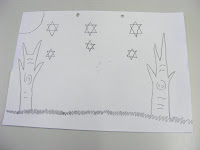


This shows one of the backgrounds I used. I used four backgrounds for my piece. They did cause some problems through because it was hard to keep the paper still whilst I moved the foreground characters, also if I used done a bit of a scene one week and done the rest the following week you can detect within my animation when I done this because the paper moves in the animation


PowerPoint "Recent Developments in animation"

This is my powerpoint I made on recent developments in animation.

I used www.slideshare.com for this.

Thursday, 24 June 2010

My animation- Loves cruel victim.

For my animation I made a 2d stop motion animation. 2d stop motion is normally where you draw your animation using a foreground and a background. You then animate the f0reground and background using stop motion. Stop motion is where you take a photo, then in this case move a part of you foreground a little bit then take another photo. When you play this photos quickly they will then give the illusion of movement.

I created a foreground and a background by drawing it free hand. The foreground where parts of my character or my whole character. I had to have different foregrounds such as arms so I could move them and only them. The reason for me having different backgrounds where for the different scenes.

For the ideas for this animation I drew them from my own emotions at the time. At the time we where set to start are animation I had recently gone through a bad break up which I had took badly. After it was over I found myself question my place in the world and what my true purpose was ?

I believe I done quite well in my animation. I believe the guy in the story the one whose story it actually is, has a lot of personality. I also think my animation is a reasonable length even through I would of liked to make it longer but couldn't do to time restrictions. It runs ok as well but you can tell the difference between the weeks because the paper changes in the camera positions . This was due to the changing of the weeks. I couldn't do all the shot in one day, and so had to come back to it. When I did come back to it however I couldn't get the paper in the same position in relation to the camera. The other I did do through was to add music. I think this went very well and gives the animation extra depth and meaning.

Tuesday, 15 June 2010

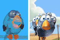
Computer animation For the Birds by Pixar


The birds is a small animation created by Pixar. The type of animation it is would be classed as Computer animation.


How it works at Pixar is one person pitches a story idea to the rest of development team and if they see it taking off they work on.

A written treatment is then created to summaries the storyline and to see what is realistic and what is not.

Storyboards are then created. Each storyboard artist at Pixar is given a script and/or a beat outline. A beat outlines is a map of the emotional changes the character goes through scene to scene.

Next comes the voices. To start with they just use normally voices until later on when they get actors to do it. Unless the voice is good anyway then they sometimes keep it.

Next comes the start of the reel making. This shows if the animation can stand by it self with no one pitching and the beginning of editorial decisions start being made.

After this the Art Department start to create a look and feel for the characters using things such as the storyboards they create art illustrating the creatures and the world they live on.

The step after this is that the characters, sets and props are either sculptured by hand then scanned in three dimensional or are just directly modeled into the computer in 3d.

The next step is that the sets are dressed. After the sets are created in 3d prop models have to be put in. Things such as table, chairs, toys. This makes the world more believable.

After this is done Pixar start laying out the shots. This puts the characters in the scenes in 3d on the computer due to the storyboards so the editing team can see what is happening and how it will carry on.

Next is when the piece starts getting animated. Using animating technology the animator starts putting movement to the face and other parts of the body using key poses and changing in between ones if necessary.

After this comes the shading this allows them to determine how much light goes onto the characters in the animation.

Then the digital light is brought in and lits up the animation much like stage lighting lits up the stage.

Then comes the rendering where all the scenes are rendered. This is the act of putting everything into such as sets, colours, character movement etc into a single frame of film.

After this the final stage comes and the final touches are added then the animation is good to go.

The effects from For The Birds depends on the individual, it made me personally review society, in the manner how the tall bird is rejected by the others for who he is. It reminds me of how some people get rejected due to learning disabilities.

It is different compared to the other animations I have seen because it is very bright and is quite short compared to others. Also it does back some for the story line, but it is very slick and well polished.

It is similar to other animations due to the well polished of it and how it flows. It gives the illusion of movement very well.

For this blog entry I used www.youtube.com and www.pixiar. com and http://news.cnet.com/i/ne/sr06/pixar/bird_466x313.jpg

Thursday, 10 June 2010

Mine and Ben's and Tiffanies pixilation

This is a pixilation animation. Pixilation is normally where people are used like stop motion puppets. A shot is taking then the change their pose slighty and another shot is taking. On this particular animation I worked with Ben and Tiffany. Me and Ben came up with the car idea. We where also the live people who where used as stop motion puppets and Tiffany worked the camera. We where trying to learn how to do pixilation well and where experimenting with it. We watched many other pixilation animations before trying to create our own. We watched things like human tetris. We developed our team and commucation skills through this exercise.

Compared to other anumations I had done by myself and with Ben this one wasnt very good. It had a good base fro a plot line but could of been expand upon and it didnt run smoothly. Notes I took from this for the next animation I did where to make sure get enough shoots and keep camera still. If I had to do this again I would make sure Tiffany put the camera further back to start with and didn't move it. Knowing the things I learnt from this to improve on precious work I would of took more shoots.

Tuesday, 8 June 2010

Mine and Ben's whiteboard animation.

This type of animation is whiteboard animation. It is done by taking pictures of a image you have drawn on the whiteboard then redrawing the image in a postion making sure they aren't to far apart and taking another picture and so on till you have taken enough picture also known as frames. When these frames are shown quickly they give the illusion of movement. For this sector of animation I worked with Ben. Ben contributed the idea of a guy jumping of a cliff and then I contributed the idea of the guy jumping off a cliff then landing on the same cliff again after falling through the sky. Ben drawed the background and the character, he was also the one who redrawed the character as he moved and I took the pictures on the camera of the character as he jumped of the cliff then returned. The aim of this animation was to make to broad our knowledge of the animation sector and the different mediums that can be used. It was also the aim that we make a succesful whiteboard animation what me and Ben did quite well I believe. The tecniques we where trying to develop where thinking skills e.g generating ideas, camera skills e.g such as shots, focusing the lense e.t.c.. Also we had to work on computer skills on Preimere Element to develop the animation and put are shots together so the played smoothly and quickly and gave the illusion of movement. I believe we did develop these skills. The skill I most developed upon was using the computer to finish of the animation and make sure it was smooth and ran well and of course that it gave the illsuion of movement.

Compared to other animations I have created I believe this one was better. it is longer then the others and also Ben has more artistic skill then me. The smoothness and illusion of movement is when excuted but it could of done with more character develop and story line. I have learnt how to do whiteboard animations which I could use in futer projects and I have developed my skills on Preimere Elements so I can use this for future projects. If I where to do this again I would add more storyline so you actually knew what had driving the character to jump of a cliff and I would develop the way he looks e.g clothes ect to bring out personality. I would also add music for added depth and effect.

Claymation

This type of animation I made is claymation. It is used taking pictures of clay figures, yoy move the glay figures a little then take a picture to give the illusion of movement. On this particualr part of the animation sectored we had to look at I worked by myself so I contributed the ideas of the story and the making of the characters and the camera work itself. The aim of making this animation was to better my skills in clay mation and to help me understand it more which I believe I did. The animation that influcened this was A short love story in stop motion by Carlos Lascano. The skill I developed through this execise was taking good shots and to not move the models to quickly otherwise the animation will not come out smooth.

This aniamtion is good and runs smoothly which is a strength but to I could of made the characters look more like people and done more on character development and concept art. I will take this into acount to help me with future projects. If I where to do this again I would develop the characters and the story, also I would make it longer because it only lasts right seconds. I may also add music to give the animation more depth and emotion.

Friday, 7 May 2010

A Short Love Story in Stop Motion.

A short love story in stop motion uses different types of animation.
The types it uses are: Live action, Claymation, 2D stop motion.

The use of sets are used well and Carlos Lascano who is the animator uses models such as the school you see in the animation but he digitally put in the background.

There is no script in this animation because there are no words or sounds made from the characters. There is a sound track, which I thought gave the animation more depth. The soundtrack is a pinao and it has a smoothing and up lifting effect on the audience.

In the little girls mind, the characters age and also create new characters in the form of their son and his girlfriend, because the storyline is her day dreaming about being with this boy she likes in her class forever and having a son with him and watching their son growing up.

Link to video.


The style of the animation I would describe as more cinematic as it is very unusual in a animation to have someone day dreaming and having sort of flashbacks where as in film it is not and I think Carlos mixes animation techniques to make his animation more unique and to give it more depth.

It has an aesthetically pleasing effect on the audience and makes the audience happy.

I think the storyline was the most important bit bout the animation because without a storyline there would be no story.

I do not think I have seen an animation similar to this; this one contains more of a mixture animation techniques and takes you deep into the characters thoughts and emotions where as most animations do not.

I think this could help me in my own production to get across some of the things about love and how to show love through imagery.

Websites used: www.wikipedia.org and www.youtube.com

Friday, 19 March 2010

Vincent By Tim Burton

Tim Burton is an American film producer, writer, artist as well as a film director. His first feature was made 1985 and was entitled Pee-wee’s Big Adventure. Since Pee-wee’s Big Adventure some of the other films he has made have gone on to win Academy awards. He is known for his dark and off the wall themed films such as Edward Scissorhands, Beetle Juice and Nightmare before Christmas. He is also known for his blockbusters such as Batman and Planet of the apes. He works closely with John Deep and Musician Danny Elfman as well as others. His next film Alice in Wonderland is due for release on March the 5th 2010.
In 1982 Tim Created his first short called Vince. Vince was a stop motion animation that was in black and white only and lasted six minutes. The animation was voice by Vince price one of the reasons Tim wanted to go into the filming industry. The film was made by someone Burton had befriended whilst working for Disney in the concept art department. This someone was called Rick Heinrichs. Vince was shown at a film was showed and released at Chicago Film festival this was showed alongside a teen drama called Tex. After Vince Burton done his first live-action production which was Hansel and Gretel. This live action was Japanese themed and ends in a kung fu fight between Gretel and Hansel and the witch. Having aired only once On Halloween in 1938 at 10.30pm and only a limit supply of the film, a copy is extremely had to find. This adds to the rumour it doesn’t existence. It 2009 the short was shown in the Museum of Modern Art. Next was also a piece by Tim Burton and also a live action called Frankenweenie. Frankenweenie stars Barret Oliver, Daniel Stern and Shelley Duvall. Shelley Duvall was an early support of Burton’s work. Tim Burtons pieces Vincent and Frankenweenie are both on the 2-disc deluxe edition of the DVD the Nightmare before Christmas.
Even through Tim Burton’s work had made it really big yet he still started to attract attention from the film industry. He was approached by Griffin Dunne to direct a film called After Hours (made in 1985) the film was a comedy about a bored word processor who survives a crazy night in Soho. The film had been pasted over by Martin Scorsese. However when financing fell through, Burton pulled out of it out of respect for Scorsese.
Tim Burton’s themes normally consist of themes such as solitude and loneliness as well as things such as insanity and madness. Tim Burtons work is also usual done in a gothic, black humour, surreal style. The genre is also normally gothic or black comedy.

Alice in Wonderland trailer.


The Becoming of Vincent

In 1982 Tim Burton made his first short animation which was 6 minutes long called Vince. He began working to Disney but didn’t work well with what Disney wanted because Disney wanted happy animations where as Tim wanted weird and off the wall. Disney gave him a small amount of money to do his own little animation but the only reason they gave him this money is because a famous actor at the time called Vince Price said he would voice the animation. After Tim Burton had made the animation Disney soon fired him.

Topic of Vincent (what happens)

The topic of Vincent is that a little boy wishes he could be like his hero Vince Price, where as him mum wish he was more like a normal boy and would just go out and play with friends and do normally things.

Themes of Vincent (Ideas and things behind it)

It has themes of madness and insanity this showed by the part where near the end of the animation the young boy sees the room “start to sway, shiver and creak, his horrid insanity had reached his peak he saw his Amcrumby his zombie slave and heard his wife call from beyond the grave” It also has the theme of loneliness therefore why the boy imagines having a wife. Another theme it has is that of isolation, because the boy wants to be someone he is not he makes himself isolated from everything and in return gets isolated from them. It also has themes such as Identity (not fitting in) (being who you want to be) This is showed by the fact the young boy wants to live with bats not cats therefore making him not fit in to what would be classed as normal and the being who you want to be comes from the fact he wants to be like Vince Price and his mum doesn’t want him to.

Childhood is also a key theme in Vincent as shows how the child can over imaginative, innocence, ambition and naivety.

Style of Vincent

Sound

It sounds dark, gothic, the voice over is deep in tone, the words are poetic though the animation making it child like somehow still though. Tim Burton seems to do dark and gothic stuff but somehow keeps it childish therefore making the piece even creepier.

It looks also look gothic, dark and surreal but also some parts are funny.
Such as the screenshot below. This depicts the boy’s sister as the object of laughter. Vincent also is comic like/ cartoonified in its animated characters. Therefore also making it child like and adding a creep effect.

Animation Technique

This was made using Claymation and was done with 2D/drawn graphics. Some of the characters features and exaggerated to create humour and all the animations are ever really big, small or really fat, thing.


My opinion

I think the animation is weird, dark and disturbing. But also interesting and in some parts amusing. The voice over is low but the way the words rhyme make it child like. I like how surreal this film is through and think it is very good. I think this animation might have actually been some what of an autobiography of Tim Burton. An autobiography of his childhood and inner hopes and dreams.

Response from audiences and critics (what did others think of it)

These responses come from http://www.imdb.com/

Beautiful, creepy, haunting, sad. A masterpiece., 5 February 2002Author: Francisco Huerta (fjhuerta@hotmail.com) from Mexico City
35 out of 37 people found the following review useful:
Expressionistic epic..., 26 May 2002Author: poe426 from USA

Ghoulishly good fun!, 14 September 1999Author: Chris Campbell from Coventry, England

Back to me

Most the critics and audiences loved it I think Disney where very dumb not to bring this out and to let go of one of the best animates ever.

Video of Vincent

Harvie Krumpet

Harvie Krumpet is a claymation. All the sets that are used are wooden ones. The house, the fire, the school and the boat are all wooden sets. The narrator is the one that reads the script and it fills in the gaps. They have used Geoffery Rush, they have used him because he has a good voice and is australia and everyone involved in it was australia. The characters in Harvie Krumpet all have problems and are all different because not only does it make it more interesting but it also makes it more like real life. The characters are also the height of a wine bottle because the animator Adam Elliot has a tick.

The style of Harvie Krumpet is that of a gothic and also comedy. This is to make it like the real world and show that everyone has good times and bad.

Harvie Krumpet provokes emotion in the audience and makes them feel like they are there. This is done by the way the characters stare out at the audience, the use of the sets and the colour of them, the way it is nattared and includes information such as the way the characters spell.

Harvie Krumpet also won a Oscar for best Animated Short in 2003, I believe it won this award because it deals with problems such as tourettes and it also shows theproblem of the war. Also it is original

The animator which we have seen which is similar is Vincent, both these animations are claymation both also both involve people who are lonely, outcast and alone. The difference is that Vincent is more disturbing because it doesn't have as much of a humor edge to it. Other claymations I have seen have been Wallace and Gromit and Pingu but these show just the good side to things and are very happy and dont deal with problems.


The websites I have used for this have been http://www.wikipedia.org/ and http://www.melodramapictures.com/ and http://www.youtube.com/

Friday, 5 March 2010

White board animation

The white board animation we watched was created by Kristofer storm, the name was of the animation was Minilogue and was made with still images that were created on the whiteboard and live action that also took place on the white board it also had metamorphosis in it. The still images were drawn 2d graphics on the whiteboard so therefore the animation techique was 2d graphics animation.

The media which was used was the whiteboard. The fact the whiteboard was used gave the animation a surreal and dream like effect.

The style of the animation was that of a postive tone and it was very upbeat and happy, it also flowed very well. The look of the animation was also very postive, happy and upbeat and the pictures flowed well. The music that was also introduced to the animation was that of a positive and upbeat tone.

The effect the animation was trying to achieve was surrealism and to make it dream like and they done that very well. My own interpretation of the animation was it was also trying to get the point across of how we should love one another and how sometimes all we need to feel is love, as well as that I also believe it tried to show that we should be kind to one another and be hapy.

I very much liked this animation because of the happy, postive and upbeat tone it was giving out and I also liked how creative and imagiative it was.

It was similar to the other animations in the way it was surreal and stood out but as the other animations which were surreal done it in negative ways and tried to show the bad side to people, this one does has a postive tone and tries to show postive emotions such as love. It was also different in the way used live action and must other whiteboard animations are not as long.


Strom also has done animations for adverts, such as this picture


You can't see the picture that well but it is a advert for The carphone warehouse, it was shown when x factor was on advertising new phones through animations.

The websites I used for this information were www.wikipedia.org and www.youtube.com
and this is where the photo comes from http://www.pixel-lee.tv/images_09/xfactor08_sc1.jpg

Metamorphosis and Zoetrope

We went to the Norwich University College of Creative Arts.

We started of are animation workshop there, doing metamorphosis, the tutro who lead the workshop was Jodie Wick. We all got a word to start with and we had to draw that word. We also all had numbers. The picture we had we had to change to the person's who number was infront of us, for example say if I was 6 I had to turn my picture into the picture that number 7 had drawn.

We done this by drawing frames for various stages of what we believe would be the transformation process from the item we had to the next item. After we had drawed these pictures we took pictures of them on a rostrum.

The rostrum took two shots of each of the frames we draw. The reason two frames where shot is so in the animation it look more clear and runs more smoothly.

To the draw the pictures we used layout paper to draw on. We done it in pencil first incase we weren't happy with them and then when we are we went other them in pen so we could see them through the layout papere. Layout paper is another item of equpiment we used, it is half way between normal paper and tracing paper. Another item of equpiment we used was also the peg bar. This is so are pictures were lined up and we could make sure they were always central to the middle of the papper.

The skills we had to use were: drawing skills, and tracing skills. We also had to have patients as the process seemed to take quite a while and drag on a bit, but the end result was really good. Another skill we had to use was we had to visualise the transformation in are minds.


After we had done the Metamorphosis, we all done are own zoetrope (also know as light box)animations. This involved us drawing eighteen pictures and setting them out in a comic book lay out. The picture we had to draw had to be not to do detailed and the change had to be distinctive and simplistic, for example someone waving their hand or something distinctive like that.

We then had to put the pictures into a zoetrope.


You then sping round the zoetrope and you look through the slots in the side and it gives the pictures the illusion of movement.

To make it more effective it helps if you go over the outline in black pen and also colour in the pictures.


These are the pictures I done on the workshop. The top set were for the Metamorphosis animation and the bottom set of picturse were for my zoetrope animation.


Friday, 5 February 2010

Pixilation

Pixilation is the term used to describe the technique of animation which involves taking pictures of living things and showing the pictures quickly to give the illusion of movement. This makes the living thing look unnatural and move in an unnatural.

Wikipedia says “Pixilation (from pixilated) is a stop motion technique where live actors are used as a frame-by-frame subject in an animated film, by repeatedly posing while one or more frame is taken and changing pose slightly before the next frame or frames. The actor becomes a kind of living stop motion puppet.”

The first animation we looked at was Food by Jan Svankmajer. It uses pixilation, clay motion and live action to make it almost real, but not quite. The types of camera shots they use are close ups, long shots and medium shots to very good effect in my opinion.


It uses the humans as vending machines to convey the truly meaning I think It has , I believe it is about Eternal damnation and the people who are queuing up outside the room to become vending machines are symbolic of those whose souls are heading to hell.

Another animation we looked at was Neighbours by Norman Mclaren. It uses pixilation only. The types of camera shots it uses are close ups, long shots, medium shots and it also has a establish scene in Neighbours.

It uses to Neighbours arguing to convey the message of how human greed and corruption can lead to violence. Were as if the humans shared violence wouldn’t happen and neither would war. It also shows war can lead to death and nothing really comes from war.

Both of the animations used pixilation and both tried to be odd and stand out, They both show the bad sides to the human race. They also both use close up, long shots and medium shots.

Food was different as it involved food and didn’t show you the message clearly, also it was really disturbing. Whereas Neighbours showed the message quite clearly and wasn’t as disturbing. Neighbours also used music and more comedy as well as that is had an establishing scene.

I think both of these animations are really good and use pixilation and their camera shots to great effect.


The website(s) I used where Wikipedia and videos are from youtube.

Monty Python

The techiques the Monty Python used were many. One was getting a picture and cutting out the mouth and chin. Another was the legs moving out of time with body and they used the techique of using odd shaped pictures of people as well as, Enlarging images, Use limbs with pictures they don't go with, Deformities, Unco-ordinated, eyes moving but pictures of face is still.

These techniques are used to create humoe which is the style Monty Python use. The Monty Python animations also tries to stand out and be surreal. The animations used fadec colours and victorian backgrounds. Monty Python also seems really british. A lot of the music sounds like old british music.

Wikipedia says "Gilliam's surreal animations have a distinctive, memorable style, mixing his own art, characterized by soft gradients and odd, bulbous shapes, with backgrounds and moving cutouts from antique photographs, mostly from the Victorian era.

The animation method is still images/stop motion which is a bit like pixlation but with im ages instead of people.

The Monty Python Animations where made by a man called Terry Gilliam. He was born in Amercia but then lived in England and became a a english citzen.

http://www.youtube.com/watch?v=dB-1d9fM3OU

I used two websites for this information. Youtube and Wikipedia